Responsive Content Field Guide
Updated, SXSW 2012: Responsive Content has generated thought from some rather intelligent people. Based on recent discussions, I've revisited responsive content in a new article.
Update March, 2012: I'm delighted to announce that I'll be speaking on Responsive Content at SXSW Interactice in Austin, Texas. Come and see the talk at 3:30 on Saturday, 10 March 2012.
Responsive content fills responsive design. Like the design, it is flexible—expanding based on screen resolution and medium to match the user's context. As content strategists, editors, and creators, we need techniques to scale content as beautifully and responsively as our designs. This article highlights several tactics.
To see great examples of responsive design, mediaqueri.es has a well-curated selection of responsive websites. Some of these examples showcase responsive content, while others keep the same content across all the sites.
Why Scale Content?
The main contention of responsive content is the same as responsive design: users on different devices in various contexts require different experiences.
To save developers form the headaches of creating and maintaining device-specific websites, responsive design showed us we needed one website with a great deal of flexibility to create different experiences. But design is not the only thing that should cater to context. Serving different content allows users to experience websites better-tailored to their environment.
Imagine, for a moment, a young web developer heading in for an interview at a company. At home, she tries to glean all the information about this company possible from their website. She wants the full story about the company. Later, she's showing a friend where she's applying on her iPad, running over a few highlights here and their. This situation requires a short story. Finally, on the way to the interview, she is perusing their website on her mobile phone looking over the website for a couple final notes. In such a hurried and brief context, our applicant requires just the cliff notes.
This example shows the need for a progression from full content to outline to highlights. Other possible situations reinforce this honing and culling of information as users switch from one device and context to another.
Armed with a few techniques, content can be made responsive without creating set versions for each context. Let's begin with the simplest technique: pruning.
Semantic Pruning
When a content strategist decides to drop a section of a website for some designs, that is semantic pruning.
HTML 5 offers some new elements to add greater semantic value to the areas on a page. In particular, header, footer, nav, article, section, aside, and figure.
Of these seven content sectioning elements, three often belong to the realm of design: header, footer, and nav. These elements may also belong to content blocks. In these cases, use the below principles to make their content responsive, if needed. This leaves four elements for content sectioning—five if you include div.
Asides & Figures
Two of these elements are candidates for pruning: aside and figure. The W3C HTML 5 Spec says the “aside element represents a section of a page that consists of content that is tangentially related to [surrounding content], and which could be considered separate from that content.” Similarly, the W3C defines figure elements as content “that is self-contained.”
Following is an example of a webpage's content marked up with these tags. It shows a main content area sectioned into content chunks and a sidebar.
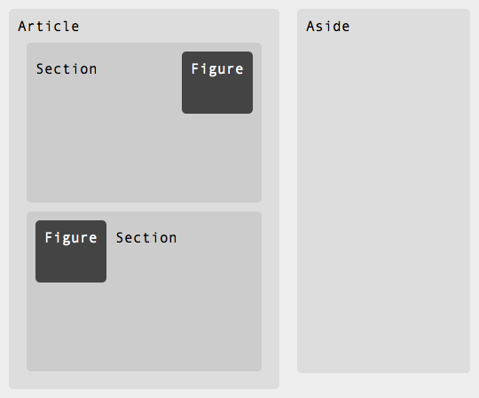
article, section, aside, and figure elements.The aside is often used for sidebar content, tangentially related, but not necessary to understand the article's content. Similarly, the figure element contains important information relevant to but self-sufficient from the content.
On smaller screens, both these elements can be safely pruned.
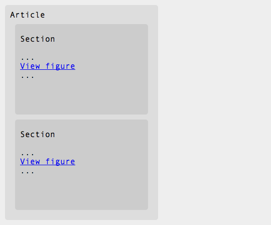
aside, and figure elements pruned. The figure elements are contextually linked.Since the figure elements contain directly relevant content, they should be linked to in the article. When the user reads the section of content, they have the option of clicking on the link and viewing the figure's information. This is similar to the publisher's technique of adding endnotes to a book, except the hyperlinking ensures the figure is easily usable.
Depending on the relevance of the aside, it may not be a good pruning candidate. In some cases, or in intermediate designs, such as a vertical tablet, the aside may be dropped down beneath the article.
Section Pruning
If an article contains more than one section, latter sections can easily be pruned to make the page more concise. Examples of multiple-section articles include sets of how-to instructions, short stories, and large business reports.
In these cases, the page loads with the first section showing. At the bottom, it includes a link to read the rest of the article. There are two ways to display the rest of the article:
- The link goes to another page containing the next section's content.
- The page pulls in the next section's content into the page using an AJAX call.
Depending on how many users have JavaScript enabled and what type of technologies are available to the web developers, only the former option may be available. However, the latter option allows for seamless user experiences and (dare I say) a nice Web 2.0 feel.
The only requirement to section pruning is having multiple sections, meaning that content creators or editors must be able to divide content into sections.
Newspaper-Style Web Articles
However, not every content management system will play nice with splitting pages into multiple sections. In these cases, writers can fall back on the journalist's habit of writing prunable content.
When a journalist writes a story she often puts the most important content at the top and then continues the story with lesser and lesser relevant pieces of information. Unlike other writing styles including academic and creative writing, the news story doesn't need a conclusion.
This technique allows editors to take a three hundred word story, cut off the last hundred words, and use it to fill a two-hundred-word column. The editor can be relatively certain that the most important content is at the top.
We can do the same thing when creating responsive content on the web. If our stories are written with the most important bits first, then we can dynamically display only the first few paragraphs or all the content before the first h2. The right balance depends on the content itself. For most websites, there exists a pruning system that handles the vast majority of pages.
Similar to section pruning, a Read More link should be added to each content page.
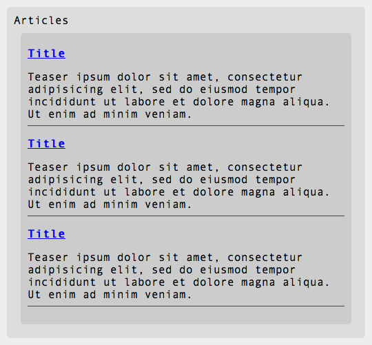
Article Listings
Pages containing articles are generally linked to from somewhere. Homepages and pages listing articles often link to articles using a title and a teaser. For compact designs, these teasers can simply be culled from the content.
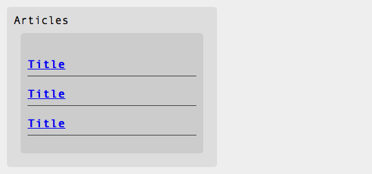
The technique of removing teasers and descriptions from a repeating set of data applies well to other content.
Consider a calendar. A calendar is made of a series of events, each with an associated date, time, location, description, and perhaps other information. A user on a mobile phone may only wish to know what events she has planned for an evening. She requires to know the event title, location, and time. The description is likely of lesser importance.
A more complex example is a product listing. An online shopper on a tablet device may be perusing a series of sunglasses to purchase. The shopper is relaxing on his sofa and is flipping through the different sunglasses. He doesn't look too carefully at any descriptions, since he is looking for a particular style. In fact, chances are, he doesn't look at the description at all. He cares about photos, price, color, and size. A link to the description may be handy in some cases, but displaying the description on each page is unnecessary.
A Silver Bulleted Structure
We've just explored ways to make articles, instructions, and reports responsive. Many internet pages are just simple content pages. We need a system of making these pages—homepages, about pages, bio pages, legalese pages, etc—responsive.
Pages on the internet often use only a small subset of HTML tags for their markup. Most pages are composed of some h-tags, paragraphs, and unordered lists. Many of these pages are text heavy in order to deliver detailed information to the user. However, this makes for long pages on skinny screens.
A Beautiful Layout
Luckily, there are standard layouts for beautiful content. One way to make the content more friendly by following a simple formula:
- Begin the page with a descriptive header.
- Introduce the page with a paragraph of 1 to 2 sentences. Make this paragraph slightly larger or bold, if desired.
- List out important points in an unordered list, keeping each bullet to a sentence.
- Limit the list itself to no more than eight points.
Beneath the list, include a paragraph or two containing any information you couldn't include in the list. Finally, if there is more to be said, include a link taking the user to a page with the full, unabridged content.
This section is written in this format. Hopefully it made for a pleasant read. It works extremely well on small screens and cramped contexts. It also works sublimely on the internet in general.
Conclusion
If you've already made the decision to use responsive design, you should seriously consider making the content responsive. Responsive content delivers different experiences to different users based on their context. Creating content as fluid as your design is not trivial. The above tactics and techniques should orient you in an excellent direction.
Here are some things to keep in mind.
Full Content
Always give users the ability to read the full content.
Don't Prune Necessary Sections
When pruning pages, don't remove titles or important meta data. Ensure a majority of users will have all the information they need on the first page.
Order Content with Descending Importance
Always lead with important content. This is good for users, since it engages them immediately. It also allows for easy pruning of content further down the page.
Armed with these techniques, your website content will be as responsive as its design.
Words of Warning
This article discusses techniques to prune content for different devices—different steps of responsive design. If you find yourself pruning lots of content, please, ask yourself why the content is on your site in the first place.